Small Stands, Big Impact
Let's address the elephant in the room: when you see your allocated exhibition space and it's barely bigger than your office cubicle, that sinking feeling is real. Everyone around you seems to have these massive, multi-level setups with fancy LED walls and coffee bars. Meanwhile, you're working with what amounts to a glorified corner.
But here's the truth that nobody talks about enough: some of the most memorable exhibition stands aren't the biggest ones. They're the smartest ones. And small spaces, when done right, can actually work in your favor.
The Hidden Advantage of Going Small
Think about it. When you've got a massive stand, visitors can wander in, get lost, and leave without really connecting with your brand or team. With a small stand, every visitor who stops by is right there with you. The interaction is immediate and personal. There's no awkward wandering or wondering where to go next.
Plus, smaller stands cost less to design, build, and set up. That's not just about saving money (though that's nice). It's about having the flexibility to test the waters at new exhibitions without betting your entire marketing budget. If an event doesn't work out, you haven't invested a fortune. If it does, you can scale up next time armed with real data about what works.
Less Really Is More
The biggest mistake people make with small stands is trying to cram everything in. Every product. Every service. Every possible message. The result? A cluttered mess that looks like a storage closet and gives visitors decision paralysis.
The secret to small stand success is brutal editing. Pick your hero products. Choose your clearest message. Focus on what matters most. When you walk past a small stand that's trying to show everything, you remember nothing. When you see one that's confidently showcasing just a few key things, those things stick with you.
This isn't a limitation, it's clarity. Big brands with massive budgets pay consultants ridiculous amounts of money to help them figure out their core message. You're being forced to find yours by necessity. That's actually a gift.
The Psychology of Space
Here's something interesting: people perceive space differently based on how it's designed. A cramped 9 square meter stand can feel spacious, while a poorly designed 50 square meter stand can feel claustrophobic. It's all about flow and visual tricks.
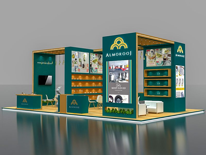
Start with an open entrance. Never block your stand with furniture or displays right at the front. That's like putting a bouncer at the door of a party. Instead, keep the front welcoming and open, with key elements toward the back and sides. This naturally guides visitors in and through your space.
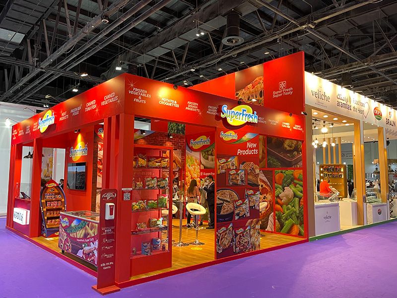
Vertical design is your best friend. When you can't go wide, go up. Tall displays, hanging banners, and elevated branding elements make your stand feel bigger and help you stand out across the exhibition hall. People's eyes are naturally drawn upward, especially in spaces where most stands are operating at ground level.
Light Changes Everything
Walk through any exhibition hall and notice which stands catch your eye. Chances are, they're the ones with smart lighting. The rest just blend into the general ambient lighting of the venue, which is usually pretty dim and unflattering.
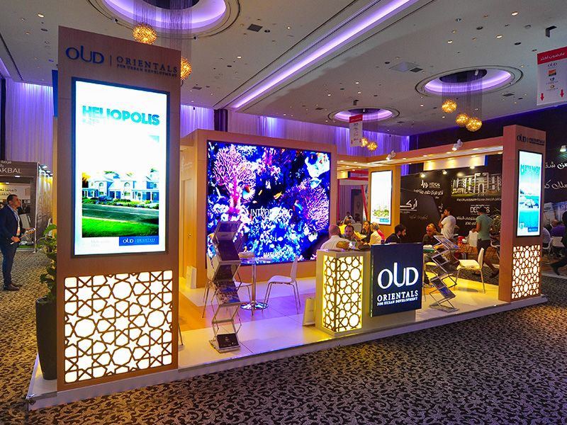
Strategic lighting can make a small space feel larger, highlight your key products, and create atmosphere. LED spotlights can draw attention to specific areas. Colored lighting can evoke mood and emotion. Even simple uplighting can make your stand feel more premium and intentional.
The best part? Good lighting doesn't take up floor space. It works from above or the sides, doing heavy lifting without adding to the feeling of crowding.
Graphics That Work Harder
On a small stand, your graphics need to earn their keep. Big, bold visuals work better than lots of text. Think of your stand graphics like a billboard, not a brochure. People walking past should understand what you do in about three seconds.
Use high quality images and minimal text. Your company name and core message should be visible from across the aisle. Detailed information can wait for when someone stops to talk with you. That's what your team is there for.
Transparent panels and smart color choices can also help. Light colors and see through materials create a sense of openness. Too many dark, solid panels make a small space feel even smaller.
Smart Furniture Choices
Every piece of furniture in your small stand needs to justify its existence. A reception counter? Sure, if you're actually collecting information or doing demos. A couch? Only if you're having real conversations that warrant sitting down. Random chairs scattered around? Probably just creating obstacles.
Look for multi functional pieces. Display units that also provide storage. Counters that can serve as both reception areas and demo stations. Furniture with clean lines that doesn't visually overwhelm the space.
And please, keep it tidy. A cluttered small stand looks unprofessional and uninviting. Have designated storage for personal items, brochures, and anything that doesn't need to be on display. Every surface shouldn't be covered.
Technology as Your Space Saver
Digital displays can replace stacks of brochures and multiple product samples. A tablet with an interactive presentation takes up far less space than a traditional display but can show unlimited information. Touchscreens let visitors explore at their own pace without needing a massive footprint.
LED screens can showcase products in action, display customer testimonials, or even create dynamic backdrops that change throughout the day. This kind of flexibility is harder to achieve with physical displays.
The key is integration, not addition. Technology should replace other elements, not pile on top of them.
Making It Memorable
At the end of the day, exhibition success isn't about square meters. It's about connections made, leads generated, and impressions left. Some of the most successful exhibitors we know operate from relatively small stands but crush their goals year after year.
They do it by being strategic. By understanding that limitations breed creativity. By recognizing that in a sea of sameness, a well designed small stand can actually stand out more than a mediocre large one.
Your small stand forces you to be clear about who you are and what you offer. It encourages more personal interactions because there's nowhere to hide. It demands that every design choice be intentional because there's no room for fluff.
Those aren't constraints. Those are competitive advantages, if you know how to use them.
The Bottom Line
Small exhibition stands aren't second rate. They're just different. And different, when done with confidence and creativity, gets noticed.
So the next time you're allocated a space that makes you want to request something bigger, pause. Think about what you can do with strategic design, smart technology, bold graphics, and clever use of vertical space. Think about the advantage of intimate conversations over getting lost in the crowd.
Your stand might be small. Your impact doesn't have to be.